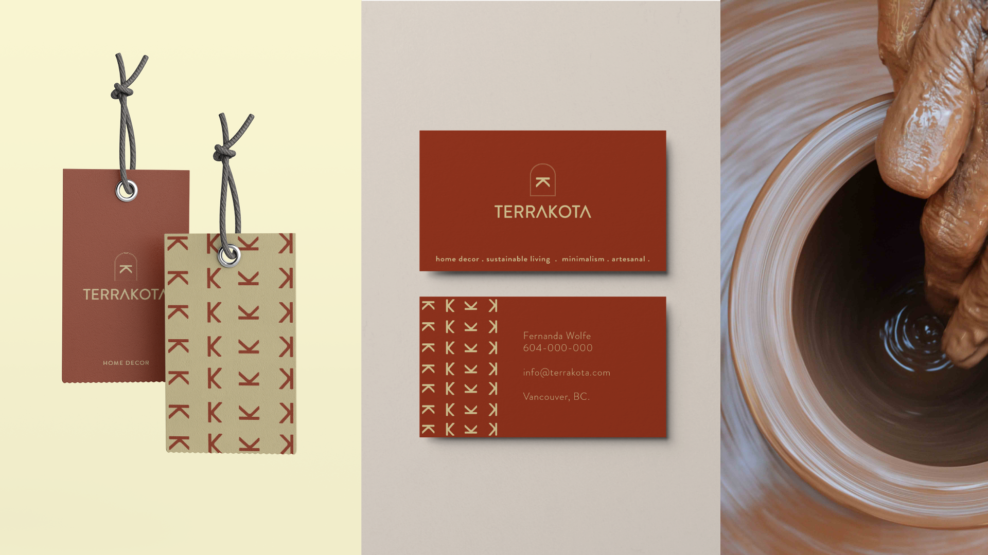
Terrakota is a purpose-driven lifestyle brand that connects people through cutting-edge design. We encourage and value living sustainably.
Challenge
Blending artisanal, contemporary, and minimalist elements under one roof. Designing a premium logo that honors the dedication of each artist whose hard work creates unique pieces.
Solution
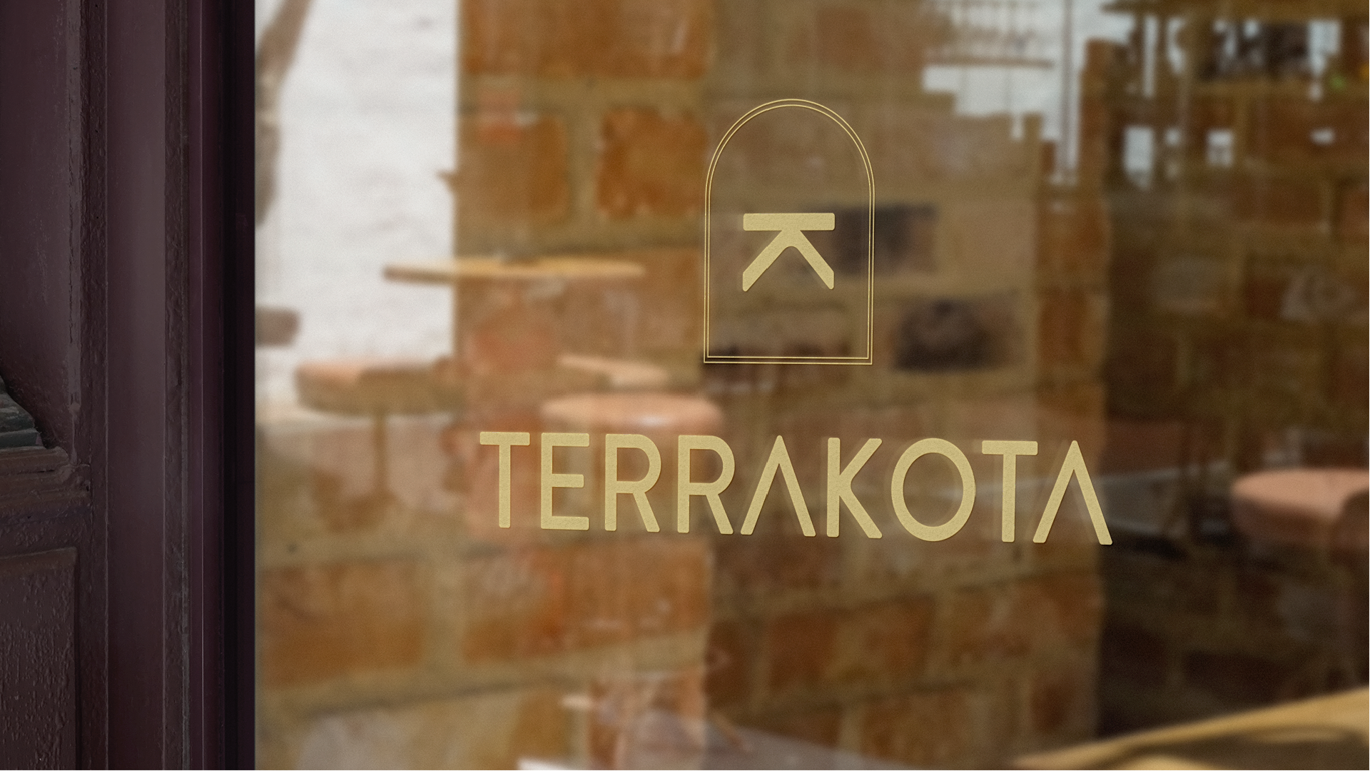
The colours are inspired by the mud and earth, honouring nature and its privileges. The letter K is inverted, as it represents the working table where our artisans spend most of their time creating unique pieces. The dome that encapsulates the K is a representation of a sacral place, the place where our artisans work.


